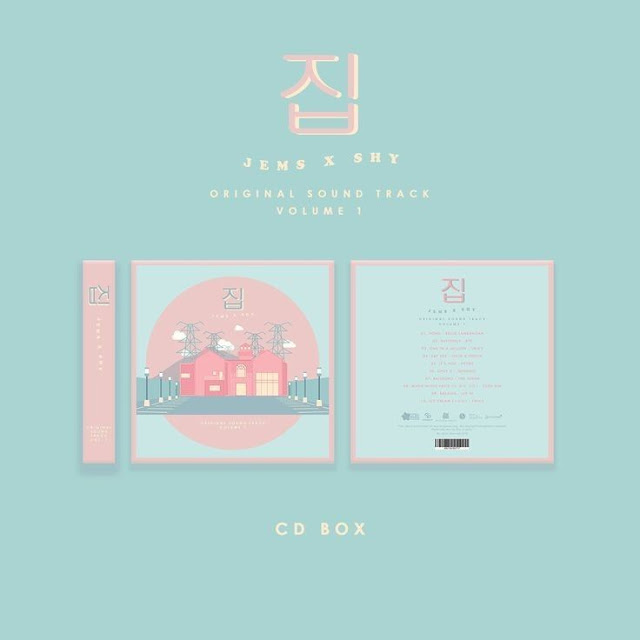
This is the digipak research conducted by Rania, from which we took lots of ideas and inspiration.
Most of the resources I have researched were from the platform pinterest. I was going through photos in other search engines such as google yet to find the aesthetic we are looking for, the pinterest platform was the best in giving results.
Reflection: Based on the photos above, artists usually have their albums set with a certain color and style which we plan to incorporate in our project. Right now, as we have decided to take shots on a film camera it may be possible to create a vintage theme in our cover, hence I put forward the idea of maybe having a vintage scrapbook concept, it would be easier to create and the amount of possibilities to create doodles and have stickers might give it an edge. Based on a lot of the young artists I have research, it is trendy nowadays to include minimalistic designs yet have the star to be the centre focus instead of a maximalist design that may draw attention away from the artist.


.jpeg)


No comments:
Post a Comment